
Pantone 2016 Colors
- Dec 28, 2015
- 3 min read
Happy Monday! If you live in the midwest, happy snow! I hope that you all had wonderful holidays spent with loved ones. We certainly did, and I loved every minute of it. Though honestly, I think I am most excited for a break from the mad dash of finishing handmade presents. I took on more this year than years past, and I am glad I did, but I am also glad to be done with deadlines for them.
Obviously we are coming up on the end of the year, and that means, a new color forecast from Pantone for the new year.

I had two immediate thoughts when I saw these colors "Well this is the year of the baby room!" and "Oh I wanna go watch Firefly." Yep, I'm a nerd, I'm married to one and he rubs off on me, or maybe it is just who I am, either way, imma watch that movie later, don't judge me, it's great.
The colors aren't in full swing yet, so finding some imagery for ideas on how to use these puppies was interesting, but there's stuff...out there, to get the 'ol wheels turning.

I really love the warmth of the Rose Quartz with marble and some gold accents. It is soft and subtle and pretty neutral without going too feminine, which I think will be the biggest trick in using this color. But there are great things that can be done with it to keep it feeling neutral.

By keeping the surrounding elements neutral, you can use the generally soft color as your "pop" in the space as well. This keeps things feeling light, airy and almost ethereal. The gold trays, again here, warm the space up and keep it from going too cold and sterile with all of the soft neutrals.
Of course there are several great color combinations you can do with these colors too!

I really love the retro nod you get by pairing the Rose Quartz with a nice mid-tone teal.

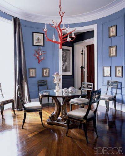
You can also go more bold in your color pairing. I love the coral paired here as an accent on the door. The blue reflecting in the windows would make a great additional accent color if you were to work the palette into a space.

I think, at least for now, my favorite color pairing with the Rose Quartz is a deep rich navy. The high contrast is stunning and again brings down the femininity of the color a touch to maintain versitility.

And here you have the inverse of the Rose Quartz and navy combo, which is equally as gorgeous.
The Serenity lends itself to some interesting color combinations and uses as well.

This restaurant in London (I shared another image from it with the pink sofa up there) is ahead of the curve, already having both colors incorporated gorgeously into their space. Here the soft blue falls into the background and operates both as a neutral and a color. The cool blue also really enhances the warm tones in the other elements in the space.
I really love a nice crisp red paired with the Serenity Blue family. Here the red is a small element in the space, but I think you could have a lot of fun working with the color combination.

How much do you love the lime with the Serenity?! I'll tell you, I am loving it a lot! I think it is a really fun and unexpected combination and I hope to see a lot of it in 2016! It gives a bold, bright and almost beachy feel.

Speaking of bright and bold, I LOVE orange and blue together and have for some time, so I really think that Serenity will pair well with all different hues of orange. I think it was done nicely in this space, maintaining a nice balance of different hues of each color and lightening it up with a fair amount of white in the patterns.
Wowzers! That was a long-winded post! Sorry for going on forever, but thanks for sticking through it with me. I was skeptical of the Pantone forecast at first, but as I did some digging, I think there will be some fun color combos to throw together with these guys and I am excited to see what pops up.
In the mean time, please feel free to share your thoughts on the color forecast and if you think it will be successful or fall flat on it's face. I always love to hear your input!
Later Gaters!
- D


Comments